
.png)

- Publishing
- Guide
- 24 mins
Key takeaways:
- Get the list of free resources to learn data storytelling to enhance your content marketing game with reports, useful statistics, relevant charts, and more.
Often businesses focus on the hard skills of using algorithms, building models, and doing calculations. But there is no point in these if we cannot represent the data clearly so that it communicates the importance. That’s exactly what data storytelling does.
Data storytelling makes data easy to understand and interesting by turning it into a story. It uses pictures like charts and graphs, along with a simple explanation, to help people see what the data means and why it matters.
Data storytelling uses a story to make data relatable and engaging. It uses pictures like charts and graphs, along with a simple explanation to highlight important insights and show their real-world impact.
In this blog, we will be focusing on the importance of data analysis in the upcoming years, career opportunities, and 30+ resources to kickstart your data storytelling journey.
But, before we get into that, let's start with understanding the term 'Data storytelling' and how it impacts a particular set of information delivery styles.
What is ‘Data Storytelling’ and why is it important?
Let's get into the technicalities of data storytelling.
Data storytelling is a way to represent the story that the analyzed data tells and personalize it as per the audience who is going to use the data. To make this complex data-intensive information easy to consume, a data storyteller uses visual tools like graphs, maps, and charts to present data clearly. Doing so makes the insights from data accessible to everyone, not just data experts.
While the benefit to individuals and consumers of these data stories lies in its simplicity, a brand benefits from publishing data stories as follows:
- Increased Engagement: Storytelling captures the audience’s attention and keeps them engaged. Engaging stories can make data more memorable and impactful, helping the brand to resonate with its audience.
- Improved Persuasion: A well-crafted data story can be persuasive, helping to convince stakeholders of the need for action or change based on the insights presented.
- Brand Transparency: Sharing data-driven stories can increase transparency, showing that a brand bases its decisions on solid evidence, which can build credibility and trust.
For a B2B business, above aspects are important to nail to ensure their target decision makers, who are usually CXOs and Managers, do trust and understand their brand. For this reason many want to publish industry reports, whitepapers, case studies, original surveys, etc.
3 Examples of Exceptional Data Storytelling
Let's look at some best data stories examples to know how others have set the quality bar:
Brexit by Numbers

Sky News used real data to explain Brexit's immediate impact on the UK using its 'Brexit by Numbers' story. Before this, decision-making was tough because of conflicting claims about Brexit.
Their data storytelling used clear visuals to make the information easy to understand. This method made the story clearer, got a lot of attention on social media, and helped both the public and policymakers understand the situation better.
Oxfam Ireland

Oxfam Ireland is different from other NGOs because they track and report their progress with data. Before this, many NGOs had trouble being transparent and accountable.
Their annual report uses maps, dashboards, and infographics to show their work clearly. This data storytelling makes complex information easy to grasp, improves transparency, engages supporters, and shows the impact of their efforts.
The Jews of Lebanon

"The Jews of Lebanon" by Arab News tells the history of Lebanon's Jewish community. Before this people were not aware of the community's history. Instead of using lots of demographic data, the team focused on one powerful number: the size of the Jewish community.
This simple data storytelling created an emotional connection with the audience, making the story clear, engaging, and memorable.
What are the top career options for Data Storytellers?
Businesses collect vast amounts of data and then use tools like BI, Tableau, Looker Studio, dashboards, and spreadsheets to visualize it. The problem with these tools arises because they only show what is happening, not why. Therefore, data science needs skilled storytellers. The field of data storytelling has grown by an astounding 233% and the demand for skilled professionals is growing every single day.
Below are the most common career options in data storytelling and their job role as well as average salary. Salary data is taken from Salary.com and Ziprecruiter.com
|
Role |
Description |
Average Salary |
|
Data Analytics |
Collects and processes data relevant to organizational goals and presents findings to support decision-making. |
$79,000 |
|
Data Scientist |
Uses tools, statistical techniques, algorithms, data mining, and machine learning to uncover trends, patterns, and insights to inform business decisions. |
$119,000 |
|
Data Visualization Specialist |
Creates visual aids (charts, graphs, animations, slideshows, etc.) to bring data storytelling to life. |
$91,000 |
|
Business Intelligence Analyst |
Uses data analysis and storytelling to help businesses make decisions, often working closely with the business team and upper management. |
$85,000 |
Top 5 universities offering dedicated Data Storytelling courses [free and paid]
Data Science Career Track – by Springboard

The Springboard Data Science Career Track includes a 30-hour module on data storytelling, teaching you to craft compelling narratives from data. Through a three-step process, you'll learn to frame questions, use plotting techniques, and create comprehensive stories. The best part is the course guarantees a full refund if you don’t secure a data science job within six months.
Price: $9900 (flexible payment plans)
Website: Springboard Data Science
Data Storytelling and Data Visualization 2022 - by Joshua Brindley on Udemy

This beginner-friendly course teaches storytelling skills from the ground up. You'll learn effective data communication, creating powerful visualizations, and transforming spreadsheet graphs into compelling data stories. With short explanations and real-life examples, it covers story arcs and provides storytelling templates.
Ideal for beginners communicating findings to stakeholders, and useful for seasoned data scientists to enhance their storytelling and visualization skills.
Price: $119.99
Website: Udemy
DSA Foundational Courses - by Data Story Academy

This bundle of three courses teaches you how to find, design, create, and present compelling data stories. It covers various effective data storytelling techniques through 3 different stages.
THE BLUEPRINT: A 5-step process to find and validate the best stories in your data.
THE CANVAS: Implement 7 design principles to creatively present these stories.
THE STORY: 7 techniques to boost your public speaking skills and captivate your audience.
For people who serve or aspire to become data professionals, consultants, and software experts, these books are a good fit, as they offer blueprints and templates to enhance data communications. The course is self-paced with lifetime access, allowing you to learn at your own convenience.
Price: $697, with discount options and a 30-day refund guarantee
Website: Data Story Academy
Data Storytelling Workshop - by Storytelling with Data

This 8 week workshop teaches you how to focus on what your audience needs before starting a data storytelling project. You'll learn to create story frameworks and improve your visualization skills. It's great for professionals wanting a quick, effective session and a good starting point for further courses and certifications.
Price: Free
Website: Data Storytelling Workshop
Strategic Data Storytelling - by University of Chicago

In the Strategic Data Storytelling course from the University of Chicago, you'll learn how to turn data into stories that matter. Over eight weeks, you'll discover how to use infographics, dashboards, and reports to share key points with stakeholders. By the end, you'll know how to tackle questions from different audiences and make better decisions with data. This course helps you understand when and how to use data to meet business needs effectively.
Price: $2,800
Website: University of Chicago
Top five books to learn data storytelling
Storytelling with Data: A Data Visualization Guide for Business Professionals - by Cole Nussbaumer Knaflic
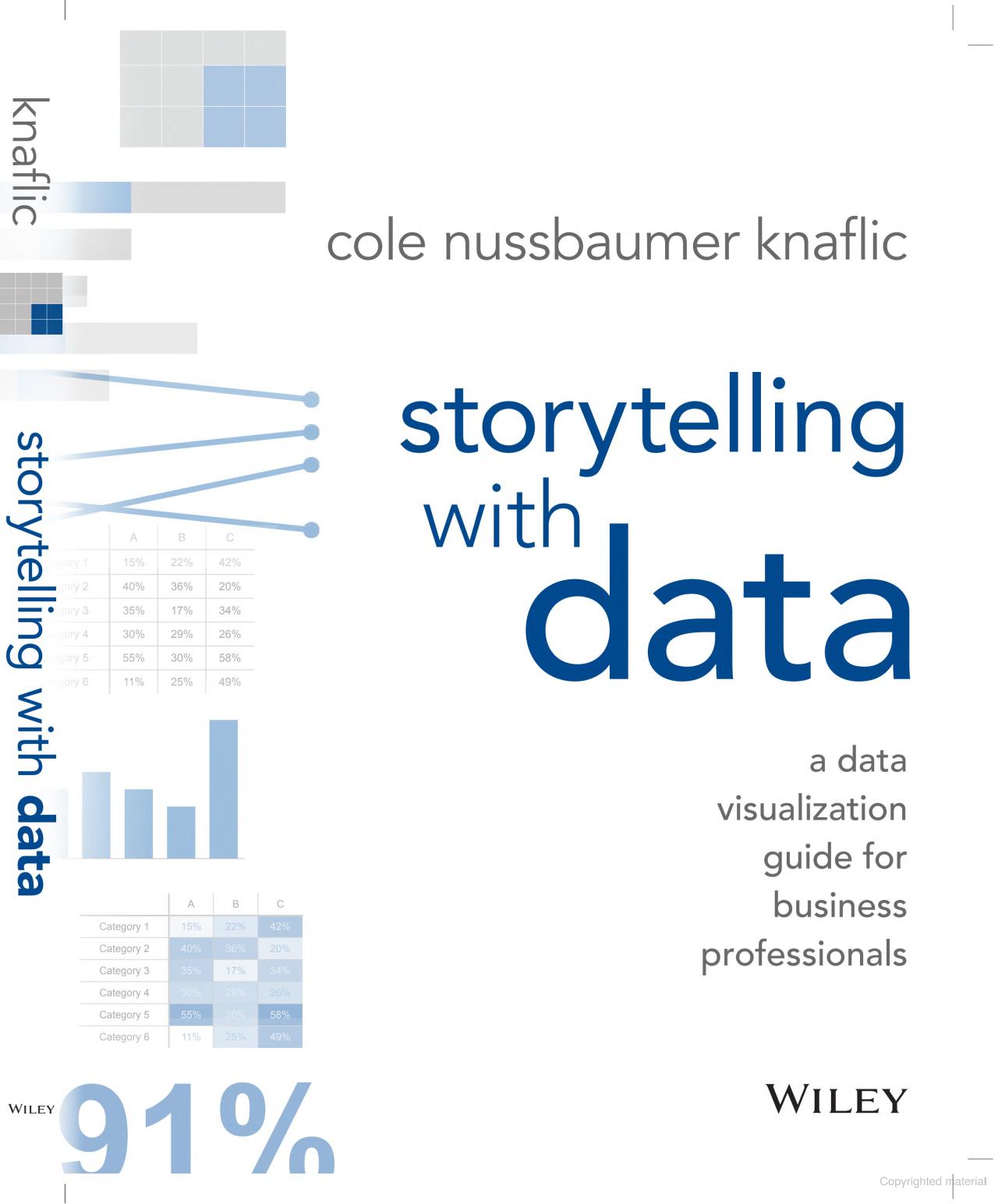
"Storytelling with Data" is a must-read for anyone eager to master data visualization and communication. Authored by Cole Nussbaumer Knaflic, a renowned data analyst and communication expert, this guide pours years of industry experience into actionable insights and practical advice. Throughout the book, you will find relatable real-world examples. The book is packed with tips on how to make your data resonate with any audience.
Date: 2015
Pages: 288
Author: Cole Nussbaumer Knaflic
Buy: Storytelling with Data on Amazon
Data-Driven Storytelling - by Nathalie Henry Riche, Christophe Hurter, and more
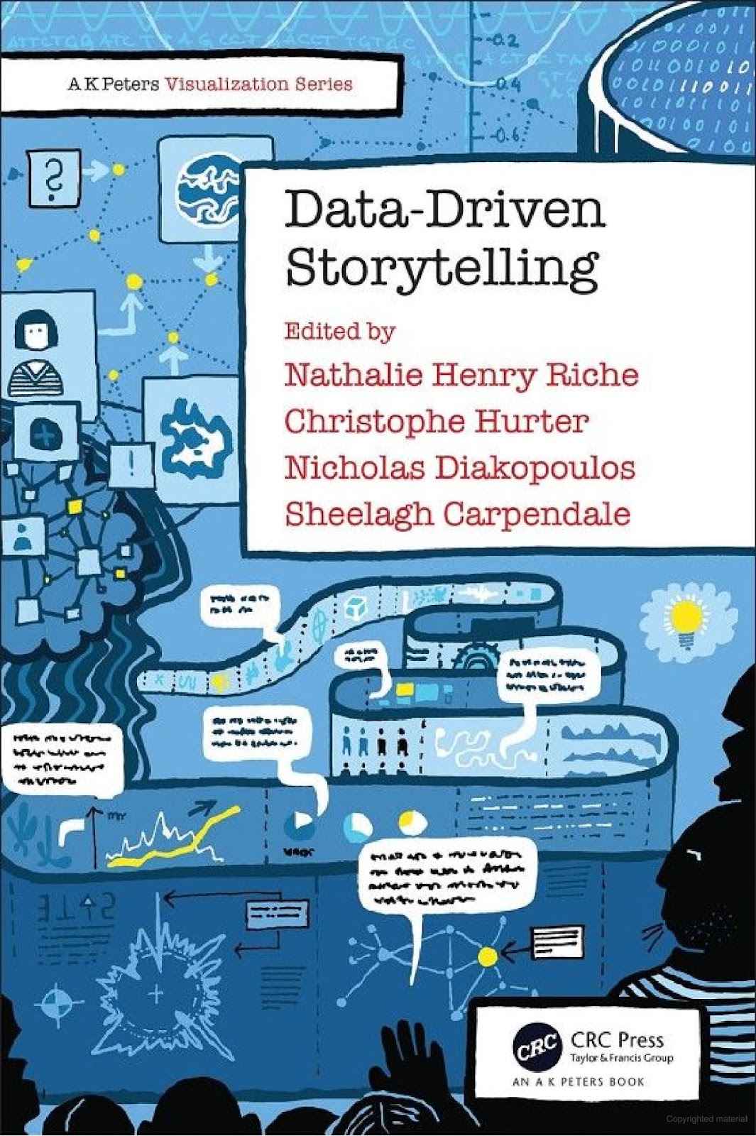
"Data-Driven Storytelling" is a practical guide for using data to tell stories. Four experts came together to write this book. It offers great tips on making data interesting and easy to understand. You will learn how to design engaging visuals, find stories in your data, and handle data ethically. Whether you work with data every day or just want to learn more, this book will help you present information in a clear and captivating way.
Date: 2018
Pages: 342
Authors: Sheelagh Carpendale, Christophe Hurter, Nathalie Henry Riche and Diakopoulos Nicholas.
Buy: Data-Driven Storytelling on Amazon
Data Story - Understanding Data and Inspire Action Through Story - by Nancy Duarte
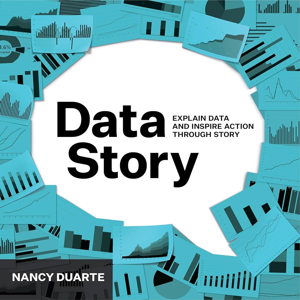
People looking forward to improving and effectively communicating with people around them, in terms of professional as well as personal, say "Data Story" is a must-read book for them.
The book covers topics such as data storytelling structure, data conceptualization principles, and how to present data in a way that resonates with your audience. People in the outlook for realistic and real-time examples, this book is the ultimate solution. It theories inspiring concepts and guides ways to implement them.
Author: Nancy Duarte
Date: 2019
Pages: 240
Buy: Data Story on Amazon
Effective Data Storytelling - Guide to Drive Change with Data, Narrative and Visuals - by Brent Dykes
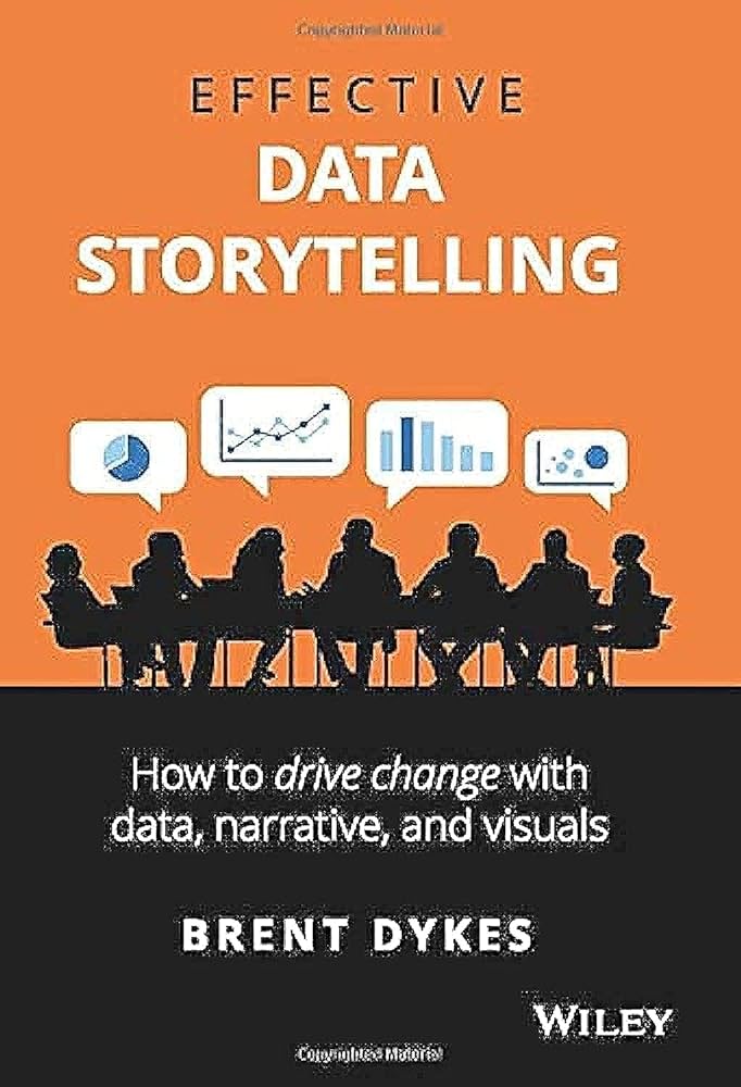
"Effective Data Storytelling" guides readers on how to use statistics to inspire change using narrative and visuals. The book covers a variety of subjects, including creating frameworks for data-driven storytelling, creating powerful data visualizations, and presenting data in a way that motivates action.
Author: Brent Dykes
Date: 2020
Pages: 240
Buy: Effective Data Storytelling on Amazon
Storytelling with Data: Let's Practice! - by Cole Nussbaumer Knaflic
Another Cole Nussbaumer Knaflic's book "Storytelling with Data: Let's Practise!" is a valuable content piece to understand about the key data visualization and storytelling techniques. This fascinating book helps readers improve their data communication abilities by creating powerful graphs, charts, and presentations. It includes exercises and real-world examples. ideal for those who want to tell stories using data and hone their skills.
Author: Cole Nussbaumer Knaflic
Date: 2019
Pages: 428
Buy: Storytelling with Data: Let's Practise! on Amazon
Best free online courses to learn data storytelling
EdX: Introduction to Data Storytelling

The course teaches you to use a spreadsheet and hone your maths skills so that you can turn data into a story. It's perfect for beginners starting their careers, journalists seeking to gain insights on data, and marketers who want to tell a compelling story with data.
Cost: Free
Website: EdX - Intro to data storytelling
Knight Center - Guide To Data Visualization for Storytelling and Discovery and more courses

This four-week course, sponsored by Google, was hosted in 2018 for almost a month. Now, Knight Center is offering the content for free to past students and anyone interested in learning how to visualize data visualization work for better storytelling and reporting.
Access: On-demand
Instructor: Alberto Cairo
Cost: Free
Website: Knight Center Journalism Courses
Data Storytelling by the University of California, Irvine

This course dives into advanced concepts for working with complex datasets. You'll discover how visual elements enhance data comprehension and see how these ideas come together to create compelling data stories.
Access: On-demand
Instructor: Julie Pai and Majed Al-Ghandour
Cost: Free for audit mode
Website: Data Storytelling by the University of California, Irvine
Best free data storytelling podcasts and Webinars
Data Framed - by DataCamp

The DataFramed podcast, hosted by Adel Nehme and Richie Cotton, explores the intersection of artificial intelligence and data in shaping the world around us. While the podcast covers a wide range of topics related to data and AI, it does not specifically focus on data visualization techniques. The podcast delves into various aspects of data and AI, including interviews with industry leaders, discussions on AI trends, and insights into how organizations are leveraging data and AI to drive innovation and transformation. For example, in episode 172, the hosts discuss data journalism and interactive visualization with Lea Pica, an entrepreneur and energetic speaker puts out one of the best episodes on data storytelling.
Listen to the podcast: Data Framed by DataCamp
SWD podcast

The Storytelling with Data (SWD) podcast is a series of audio episodes that delve into various aspects of data visualization and effective communication. The podcast is hosted by Cole Nussbaumer Knaflic, a renowned data storyteller, and features conversations with experts in the field. Each episode focuses on a specific topic, such as feedback in data visualization, creativity with data, and presentation preparation, among others.
Listen to the podcast: SWD Podcast
Data Viz Today podcast

Data Viz Today is a podcast that helps information designers become more effective at their craft. Hosted by Alli Torban, the show features interviews with leading data visualization experts who share their experiences and insights on topics like freelancing, art direction, prototyping, and presenting work to clients
They offer practical advice and wide-ranging tactics that may be put into practice, covering anything from recognizing and controlling anxious behaviors to purposefully modifying style while preserving authenticity.
Listen to the podcast: Data Viz Today
Case Studies On Data Storytelling to learn more
Marie Curie
Every year, Marie Curie offers care and support to over 40,000 terminally ill individuals and their families in the United Kingdom. Marie Curie's recent campaign, The Great Daffodil Appeal, used data to personalize emails for supporters.
They included maps of nearby collection sites based on each supporter's location. Marie Curie also used data to target specific groups and send personalized messages. The campaign worked well, with more people registering to help, especially online, showing how the charity is adapting to the digital world.
Transport for London
Transport for London (TfL) wanted to reduce pressure on the underground network by encouraging people to use other transportation options. They created a website that works well on any device, like phones or tablets, to help people find their way around London's public transport system easily. TfL also wanted to teach people about other ways to get around, like buses, bikes, boats, and walking.
They made three different versions of the website for different screen sizes to give users a better experience. Even though they faced challenges, they kept things simple and asked customers for feedback to make decisions faster.
A cool feature called "Near Me" lets users see transport options near their location instantly. Since launching the site, it has been very popular, with millions of people visiting and viewing lots of pages.
More people are using the site on mobile devices or prefer customized mobile apps, especially on weekends. And more people are using the Journey Planner tool, showing that the site is helping people find their way around London better. TfL's website improvements are making it easier for everyone to travel around the city.
Homebase
Homebase wanted to make their emails more engaging and profitable. Before, they mostly tried to get people to buy things with discount codes. Now they needed to shift towards nurturing customer interest in Homebase before purchase decisions.
To overcome this business huddle they looked at subscribers who seemed interested in kitchen stuff. Then, they sent these folks special emails called the 'Kitchen Trigger' program. These emails had clear buttons to click and encouraged people to think about Homebase when they wanted to buy something.
The 'Kitchen Trigger' emails did really well! More people opened them and clicked on them compared to other emails. Plus, almost half of the people who got the emails booked appointments to visit Homebase. And out of those, about 40% ended up buying something.
Topshop
After redesigning its mobile site, Topshop wanted to help new visitors find the new menu and navigate the website easily. They used a pointer to show first-time visitors where the new menu was for five seconds.
Topshop also wanted to test whether the small changes they plan to make will have any positive effect on the website before allocating technical resources. The company redesigned the homepage and used real-time feedback to find areas for improvement.
They tested four different search box designs, changing the text and adding a border. They also tested changes to the size selector, 'details' and 'delivery' tabs, 'added to bag' pop-ups, and various buttons. These tests were shown to different users evenly.
Each change was shown to different users evenly to get fair results. After testing, they could see which designs performed better. They finalized the changes to implement on their product page.
The new mobile layer increased products added to baskets by 4%. Changes to the search bar increased conversions by 5.8%. Overall, the product page changes led to a 9-11% increase in conversions.
Best YouTube Channels to learn data storytelling
Andy Kriebel

With 62.2K subscribers this channel is a great place to learn Tableau through his "Tableau Tips" playlist. He covers everything from basics to advanced techniques, using real-world examples to make learning engaging.
YouTube channel link: Andy Kriebel
Storytelling with Data

With 40K subscribers the channel offers clear and engaging tutorials in their "Featured videos" playlist. They focus on improving data visualization and presentation skills, providing valuable insights and real-life examples to help viewers tell compelling stories with data.
YouTube Channel Link: Storytelling with Data
Mo Chen

Mo Chen is a Data Analytics Professional and Content Creator, who shares tips for effective data storytelling. His channel has 96 subscribers and some super practical advice on crafting engaging narratives with data.
YouTube Channel Link: Mo Chen
Tools and Templates for data storytelling
RAWGraphs

One of the simplest and fastest ways to make sophisticated visualizations is with RAWGraphs. This long-running open-source project offers a straightforward, step-by-step method for making downloadable images that can be embedded into web pages.
Website: RAWGraphs
Datawrapper

Among several tools worldwide the most famous one among journalists is Datawrapper. It offers a range of eye-catching visualizations and sophisticated maps, as well as configuration flexibility to create the exact visual you require.
Website: Datawrapper
Alteryx

It is an application that handles reporting, analytics, data preparation, and spatial design on your behalf.
Website: Alteryx
Pew Research

The tool is mostly used for media studies, social and political trends, demographic research, and public opinion polls. Their "Fact Tank" provides excellent infographics and data visualization inspiration.
Website: Pew Research
Data storytelling communities to join
- Data Science Network: A Slack community with over 3,000 members.
- Data Umbrella: Has a community that supports Discord with 400 members, and guides with ML, AI, and DS.
- Locally Optimistic: A Slack community with over 7,000 members.
- Academic Data Science Alliance (ADSA): It hosts events for spreading knowledge about IT and also manages a community that is thriving with 1,000 members.
- Data Quality Camp: A Slack community with more than 9,000 members.
- Data Science Salon: Has a community of over 3,000 aspirants over slack. Serves on-site as well as off-site events.
- Open Data Science Conference: An annual conference in multiple locations with a Slack community of 4,000 members.
- Data Talks Club: A Slack community with more than 47,000 members.
- PyLadies: A global community with local chapters and a Slack community of more than 10,000 members.
- Data Visualization Society: Organises an annual conference and has a Slack community of over 16,000 members.
- Data Angels: A Slack community for over 1,600 women in data or those interested in a data career.
Want to share your favorite data storytelling resource for everyone to know?
Data storytelling is crucial for businesses to effectively communicate insights from complex data. Through visual tools and compelling narratives, it makes information accessible to all, not just experts. With a growing demand for skilled data storytellers, exploring the provided resources and career options can kickstart your journey into this exciting field.
If you have any resource to share - please email to content@merrative.com and we would be happy to list it here.
.png)